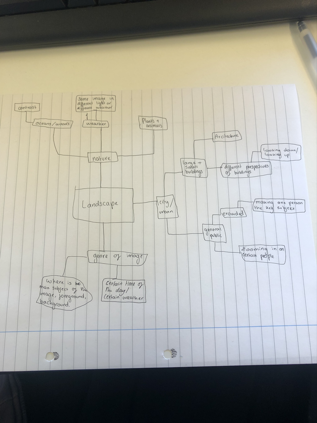
Introduction to landscape
|
Our new project idea is Landscapes and here is some information on them.
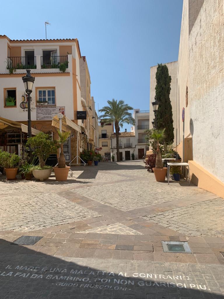
When I think about landscapes I think about wide area pictures of views of nature or city sky lines, Landscapes are all the visible features of an area of land, often considered in terms of their aesthetic appeal. When I think off landscapes I think about views, country sides, city sky lines, location, painting, mountains, sunset, fields, general public, forests. My ideal landscape would be an extended flower field with the sun setting in a pink tone in the background with insects and bunnies jumping around. |
|


Then there's a deeper part of landscapes that we don't really think about because it goes on forever. For example instead of just looking at a the image quickly if you actually look at the same image for a long time and let your imagination wonder you start to realize that every time a photographer takes an image they manipulate the landscape in many different ways by the lighting and what your taking a picture of and what [arts of the landscape you're hiding whether it be on purpose to hide a part of the view that they didn't like or by accident just by the positioning of the camera. An example of this is maybe in the mountains if you let your brain wonder and make up stories that might of happened in the interlocking spurs of the mountains like adventures that families have gone on, proposals made in a beautiful landscape, maybe even a murder that's been hidden and never solved.
Also another big idea of landscapes is that landscape is always political, like who owns the land and if you are actually allowed to take pictures on that land and it makes you think about the history of that land for example in cities for like urban landscapes it makes you think what it looked like before all the buildings were there and it was probably native land or farm land in the medieval times.
Also another big idea of landscapes is that landscape is always political, like who owns the land and if you are actually allowed to take pictures on that land and it makes you think about the history of that land for example in cities for like urban landscapes it makes you think what it looked like before all the buildings were there and it was probably native land or farm land in the medieval times.
|
This is urban landscapes which I prefer because its very more chilled out and a lot more interesting to look at as you can play around with the lighting and it coming through the different buildings. |
|


Guy Tillim
|
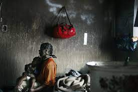
This is Guy Tillim, I really like his work because its quite urban and some of his pictures are of war zones and war photography so clearly he's gone to quite dark and dangerous places to take photos and document what is going on in those places of crisis. This photo caught my eye first though because most of his images are black and white or grey toned down but this has a burst of green surrounded by a darkened grey frame.
|
This image is also like its a quite run down home and they've just taken a chunk out of a wall to see what overgrown nature has been going on outside but the inside of the building is quite similar to the outside because it looks really run down and not well kept like the outside. Here are some more examples of Guy Tillims work.


Helene Binet
|
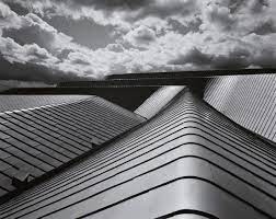
This is Helene Binet and all of her images are based on modern architecture and she was born 1959 25 of July. I quite like her work because its very abstract and really sharp. She works with angles and modern designs and only uses black and white and grey similar to Guy Tillim
Helene Binet works only with photographic film which explains why all of her photos are in black and white. |
I really like her images because they are quite eerie and the last image reminds me of a gothic horror in the Victorian times like the dark alley ways. But I also like how the middle one you cant really tell what it is.
Respond to the artists
For the second part of this project we have to make a response to each artist we chose with 10 images that are inspired by them but with elements of our style and the artists.


This is my first response to Helene, it was kind of difficult as her pieces include quite large structures and abstract buildings but as I'm staying indoors today I picked u the elements of the black and white and nature and sharp corners and the use of going close to something so you cant really tell what it is at first glance.
I'm going to make more responses to this artist when I'm out and about and try to take pictures inside buildings of normal things but zoom in to make them abstract and peculiar.
I'm going to make more responses to this artist when I'm out and about and try to take pictures inside buildings of normal things but zoom in to make them abstract and peculiar.


This is my first response to Guy Tillim, he was actually quite hard to respond to as most of his pictures are of war scenes or poverty so I took my inspiration from the first photo of his I described earlier as that is what I can actually complete, still quite hard. But these are my favorites that I took. Some of them are zoomed in and I took a screenshot from another picture.
I am also going to create more pictures so I can complete the 10 images task. But I have a few ideas for taking pictures, for example taking images by looking up towards a building that I'm standing very close to to give it a strange depth and also take pictures from far away but mess around with angles.
I am also going to create more pictures so I can complete the 10 images task. But I have a few ideas for taking pictures, for example taking images by looking up towards a building that I'm standing very close to to give it a strange depth and also take pictures from far away but mess around with angles.
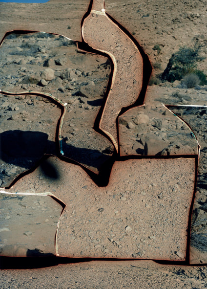
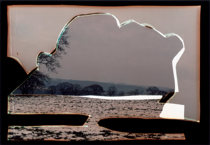
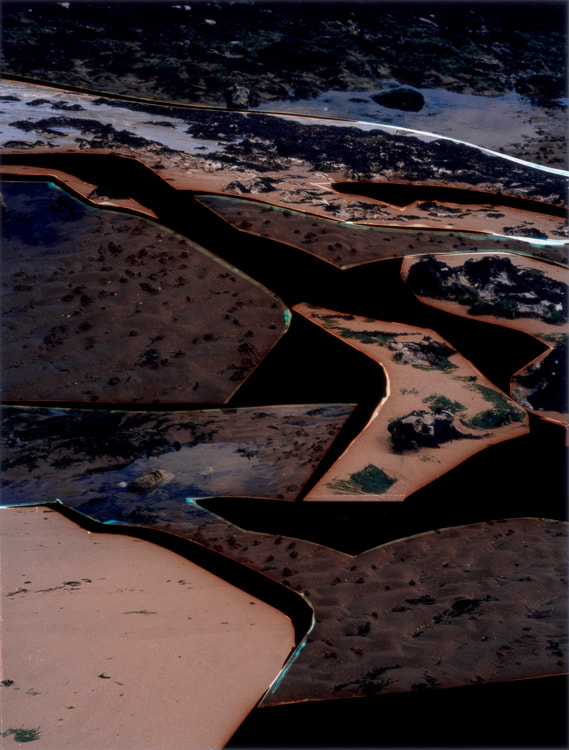
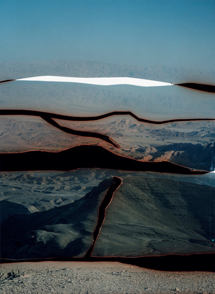
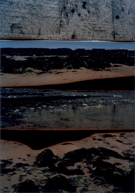
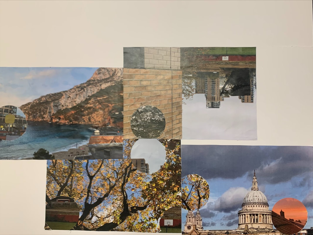
Dafna Talmor landscapes
Daphna is an artist and lecturer based in London and has been exhibiting work nationally and internationally since 1999. She's written one book called constructed landscape and it was realsed in October 2020
|
|
|
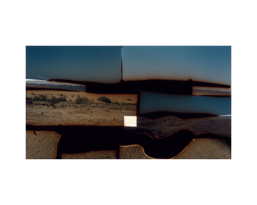
On viewing the images I think they are each constructed from many different landscapes because they all look broken up and some look like different shards of glass and others look like they could be one photo when you glance at it but then if you look at it in depth. Or for one of them in the top right that looks like one image but its been bent and mangled so the image looks broken up and but I think its actually just one.
|
|
I chose this image because i really like the way that it looks like a burnt polaroid on top of a different image thats also been tampered with. I like that the image is broken up into sections so the big out lining looks like a the polaroid has been burnt and the the photo underneath is another polaroid but that has been bent. The images i've put underneath are examples i think the artist has done to the images in the photo. Ive never seen burnt polaroids on top of one and another and bent and distorted like that and I really like how unique the artists style is.
|


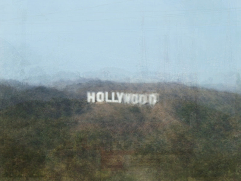
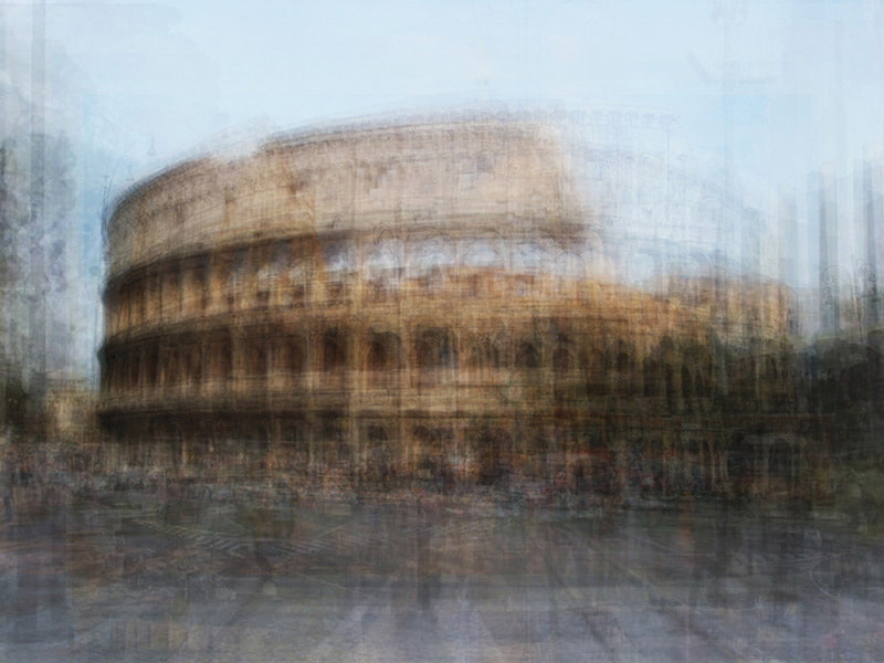
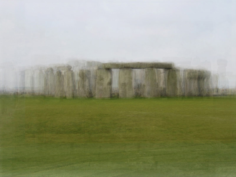
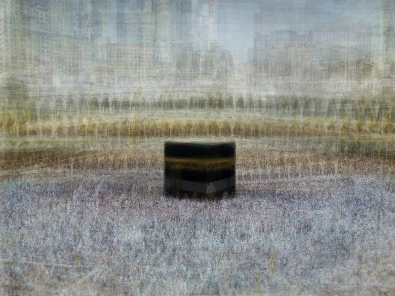
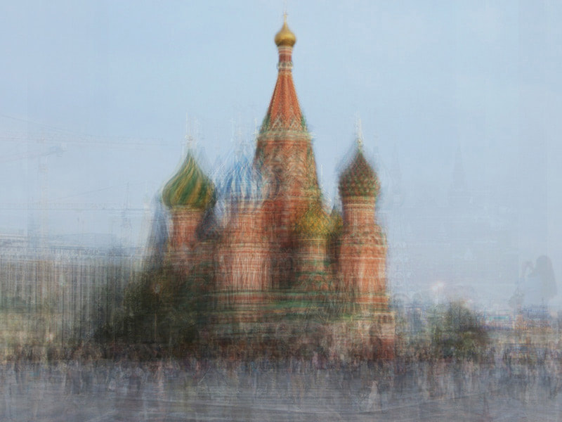
Corinne Vionnet
|

|
|
French artist in 2005 started researching tourists landmarks and exploring conscious and unconscious lighting decisions and how it effects the image of that location. Her work is about thinking about the best spot to take a picture of a landmark, where do you stand to try and capture the beauty of these landmarks and the history and the culture.
|
We have to pick one image and this was the one i picked, i chose this because stone henge is known for being quite mysterious and mythical so the way this is edited with the lighting is really interested. The image looks like its theres been multiple images taken of stone henge but from different angles and they are layered on top of each other to make the blurred effect on the image. So Vionnet has taken tourists images and combined them. I think thats what she does as in the other images i picked out in the more popularised areas you can see the public faintly as there area so many images on top thats why its quite blurry.
|
|
I have chosen this artist to research specifically because I am going to take lots of pictures of the same scene but slightly move each time I take a picture so when I merge all of the images they will have that blurred abstract effect that makes it quite eerie.


This is my response to Corinne, I took multiple pictures of the same place and moved around silently. I'm going to mess around with the different pictures I took and see how well the pictures merge.
I really like the second and the third because I think the pictures i took merge quite well together but i believe there's only two images merged so i want to merge more. The way i layered them was i got an app where you can add them on top of each other and i really like how they turned out.
I think I'm going to maybe stick with this style of layering photographs because its not extremely hard but gives my work an edge.
Corinne normally takes photos like this but of famous landmarks but I'm going to try it out with more urban settings to put my own style into it but still taking inspiration from her work.
Task 4
1) On viewing the images how many landscapes do you think they are constructed from?
I think the images are constructed from a large amount of tourists photos from the majority of the same angle of the location but as you can see in the stone hedge image in the bottom theres fencing so thats clearly taken from a completely different location. So the majority of the images are from the same spot and angle but some rogue photos are added in to give the blurry effect.
2) What can you identify in the images?
I can identify that there are some images taken from different angles and when it was more busy than others and different weathers.
3) How do you think the images are constructed?
I think she collected a large amount of images of the same location and layered them and played around with the lighting
4) How do you think this landscape has been processed/ what is the technique
I think the artist used photoshop to blend all the layers together and might of blurred the edges more to enhance the hazy/ distorted.
Charles Wilkin
Charles takes landscapes from vintage magazines and interrupts them with bursts off color either in a jagged way or in a way that the texture and colour blend in with the background. At first glance in some of his pieces it looks like fabric from a more modern magazine has either been placed or photoshopped into the original image but I think they are more colored shapes either photoshopped in to make it blend well with the background or its an actual collage with the combination of the shapes on top of the image or coming through and bursting out into the foreground of the landscape. The shapes are placed very Centre like Centre of attention and taking away the attention from the landscapes. One of the questions was 'do the colors make sense?' and I think this question differs on who you ask because you may ask one person that question and they could see a hot mess and a ruined landscape, but then ask another and they respond with a masterpiece. Personally for the first two i think they are really well blended into the background image even though how messy they look at the first glance. With the background landscapes being so mellow the colors really burst out, it looks like some sort of alternate universe its trying to burst through in the image. With the bottom two images i think they are quite different to the first two because they are more jagged and it looks like something is trying to burst through the middle of the image from behind. The way he's placed the shapes on these two really makes you wonder what he was trying to say with it, and linking it back to the deeper meaning behind some landscapes that you don't know the history of that landscape and not being able to see the whole picture because the photographer can pick and choose what they want in the final image. Back to the last images, the way the colors and shapes are quite aggressive and this might imply there's some larger quite angrier meaning behind these images that we are unaware off.
|
|


Mock project
Being pressured into being perfect in an inperfect world


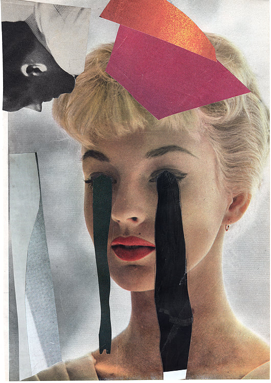
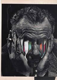
This is part of my final project, I wanted to pick an idea so it could have sort of a deeper meaning/ story to it, so I picked out images of models with the intent of their being derelict buildings in the background like blurry with mellow colors showing the imperfect world, I also kept having the idea to cut all of their eyes out of at least blur them to show that even if they are being pressured into being 'perfect' it shows that they have a deeper side to them and maybe how they are controlled by the media and their modelling agencies.
So I started off with cutting out a large range of models from different magazines and then put them into color coordinated sections, black and white, blue, yellow and pink and this helped divide the images nicely instead of just randomly putting it all onto a background. For my original idea I was going to stick them onto this one background with the buildings faintly placed over and underneath the models. But I made them into 3D pieces instead, so i stuck the individual collages onto cardboard and cut and traced them out as final pieces, each color section is one 3D piece so I could move them around and play with the color combinations and the height of different things.
I hope that in the upcoming lessons I can play around with different backgrounds and which colors look best where and how they compliment each other. For example I might try making backgrounds at home with the derelict idea in mind and I plan to make a collage of landscapes to put as the background. I'm definitely not finished with it because currently it just looks like a bunch of models which wasn't my intention and I think it looks quite bland right now.
|
This is the type of background i would like to put in the background of the 3D models or put it over the top faintly with editing on photoshop so they are faintly in the fore ground and background or either with a projector. I would want something more like the middle one with the colour but the actual image on the right with more vibrant but still mellow colours so like dark ivy greens or dimmed purple. |
|


This is my final mock piece where I projected different images onto my collage and re-arranged the way the collages sat together. My favorite is one is the red one on the left because I think it was better to use block colors instead of more grey because the other images I was projecting didn't come out that clear so it didn't really have the effect I planned for. I wanted it to be a large collage of models put together abstractly with urban abandoned buildings over the top clearly but not blocking the models.
If I could do it again I would change the images I projected to more block colors, maybe a darker red or green to make it abstract and change the way people will view the image.
If I could do it again I would change the images I projected to more block colors, maybe a darker red or green to make it abstract and change the way people will view the image.
Awoiska van der molen
|
|
Awoiska is a Dutch artist who was born in 1972, who mainly photographs landscapes in black and white. She does not tell anyone where her photos are actually taken because she believes that if she reveals the location then her photos will be viewed differently as people have different perceptions of places. She also doesn't like the idea of landscapes, she only takes them because of the pure nature and how untouched it is by infrastructure. She repeats that she wants to 'return to our origin'
|


I quite like these photos because i think i they are a good reflection of my response to Awoiskas work, they are very focused and mean a lot to me as they were taken in my school which i go to everyday but taking images like these lets you see your surroundings in a different way. I especially like the coloured one because i really like the green and the red on each other, its less like Awoiskas work but still has the personal landscape element.
|

|
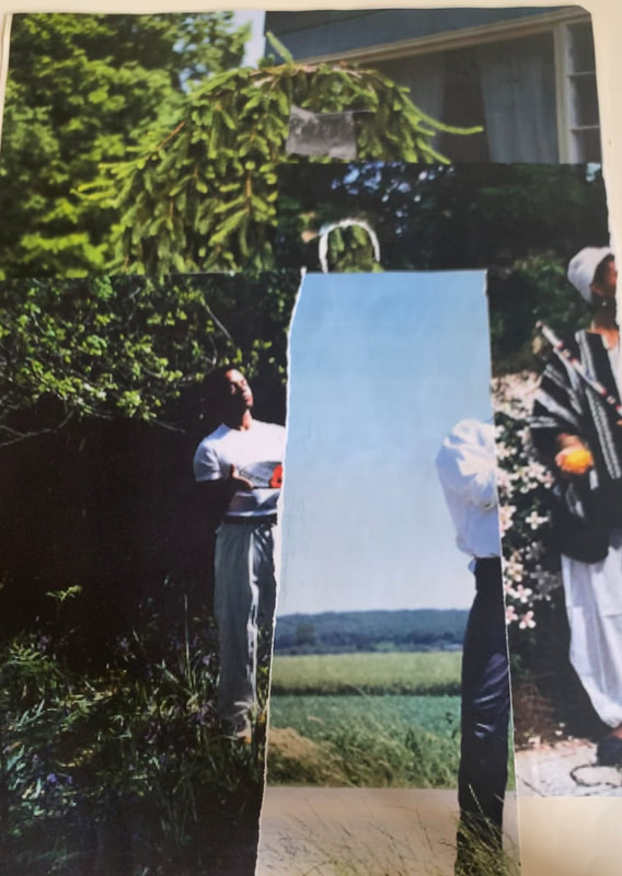
My own landscape
I chose the theme of Spain to base my landscapes on and I collected a selection of photos from every year that I've been there because it is a very special place to me as I've gone there every year since I was born with my parents and brother and go to the same villa so there are a lot of memories from going there every year. Each photo is important to me in different ways as they all have a memory that provokes a certain emotion in me whether it is good or bad but I believe it is still good to keep the photos that might have bad conations behind them so you can reflect on that memory and why you felt that way.


Digital collage
|
This is a landscape of the back of the school but in various positions and the last photo has a plastic cover over the camera because I wanted to experiment with different films. I might expand that by getting different colored ones from maybe sweet wrappers or card.
|
|


I quite like these specific ones because it's quite urban and I like the tunnel vision you get from the way its taken. I moved back and forth to get different perspectives but still keep the original concept.


I like some of these, I think I could position the camera better to match the railing at the bottom to enline it.
I think i also should of taken images from different spaces and closer and further away from the buildings
I think i also should of taken images from different spaces and closer and further away from the buildings
Project
Im going to take inspiration from this artists work and put my own twist on it by doing other thing than just trees and maybe make it more urban with buses and sky scrapers.
Assessment project.
These are the original images I took to use for this project. I wanted to get a different range of landscapes so I had leniency with my ideas and could expand the easily. Its a range of urban and nature, Id like to expand my photos to more landscapes but its a bit difficult seeing as covid is still quite a big factor in terms of traveling. These photos are quite similar as they are all sky lines and have a similar look. I was inspired by Antti Laiinen to create collages using shapes so this was my first experiment.


Antti Laitinen
|
This is Antti Laitinens work, Antti was born in may 1975 in Finland. I really like his art style by making the photograph seem ethereal and magical. He uses a lot of photoshop but I wanted to take his idea of taking things away from the photograph but then also adding something different back to the image. I really wanted explore the way different landscapes contrast and compliment each other. For example in three of the responses by using a large whole puncher and cut out different parts of one landscape and then stuck that onto a contrasting landscape that peaks through the wholes. Then for the response in the bottom left I added the cut outs onto an image in a certain way by connecting lines from the background picture to the added on pieces. Finally I added all of the final pieces onto mount board in a way so that all the lines roughly added up and linked to one another.
|
|


|
|
So firstly i chose 4 quite different photos so I had a lot to work with by making the images contrast each other. I didnt really have a final outcome in mind that i was working towards i was just kind of working freely and creating different types of the same idea. I put the photos together that i thought contrasted each other the most. In the bottom right is probably my favourite as i lined up the circles to the original image and used tow different types of contrasting landscapes. I then had 4 final outcomes but wanted to make a larger outcome combining them all so i had to think about how i was gonna position the collages.
|


I would like to carry on with this or restart it because id like to make an outcome with more of a stable theme of landscapes. For example making all the larger pictures the same themes or enlarging it and cutting it up so its scrambled around but you can still tell its the same photo, such as an image of sky scrapers in London and cutting the image into cubes so moving a cube which has the sky and the peak of a building to the bottom of the page and switching it with a cube with more windows and more building it in, and then the circles will be more nature to have a really strong and solid contrast. I would also use the whole of the mount board to make it quite large and full.
Acetone


|

|
Acetone process is the process off printing out an image and turn in upside down facing downwards onto card and the paint with nail polish remover over the image and then place a heavy object on it and leave it for a while and remove it and it comes off as a more urban and old version of it. I tried to make a coloured one but it didn't really work as you probably need a lot more acetone for that. I am planning to working with acetone more though as I really like the outcomes and its a really interesting process and id like to make more outcomes with colour. My final outcome is the one on the top right which i am quite happy with. It is quite a long process because if you try it and it doesn't work you cannot reuse the same piece of paper with the picture on it you have to reprint the image and start from the beginning which is very annoying. Ive been practicing at home trying to find different ways it works best with. These are a few examples that ive found that portray how the process works. How i would improve more is to make a bigger actual piece of art with it, so id use a larger peice of mountboard of cardboard and have a clear lay out of photos and having their placing make sense.
|
These are a few examples of actone being used to create something, in the future when i have mastered the technique more i will start to do more advanced images such as humans and more intricate images and maybe make a whole crowd of people from acetone images.
|
|


Researching artists
Vanessa Marsh
Vanessa uses a lot of editing and different techniques to capture the euphoric aura. She uses multiple exposures and dodging and burning techniques.


Stephen Gill
I really like this style of photography, taking images and then making them 3D and bringing them back to life almost. Stephen takes images and then finds nature around him to add to the image and then takes a picture of the final piece back in nature where he got the flowers and berries from in the first place.


The agoraphobic traveller- Jacqui Kenny
|
This is a few of my favourite pieces from Jacqui Kenny, a photographer who suffers from agoraphobia and struggles to leave the house. So instead she goes on google maps and takes images from all around the world. Looking at her images she does seem to have a specific theme with her images which is quite open landscapes with very subtle but effective main subjects. She has also made a book which is small 6 different books with different images in the centre of the page. This made me start thinking about how im going to present my final pieces from each project.
|
|


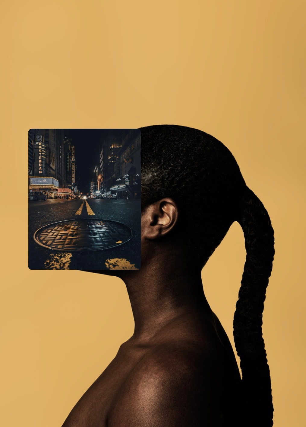
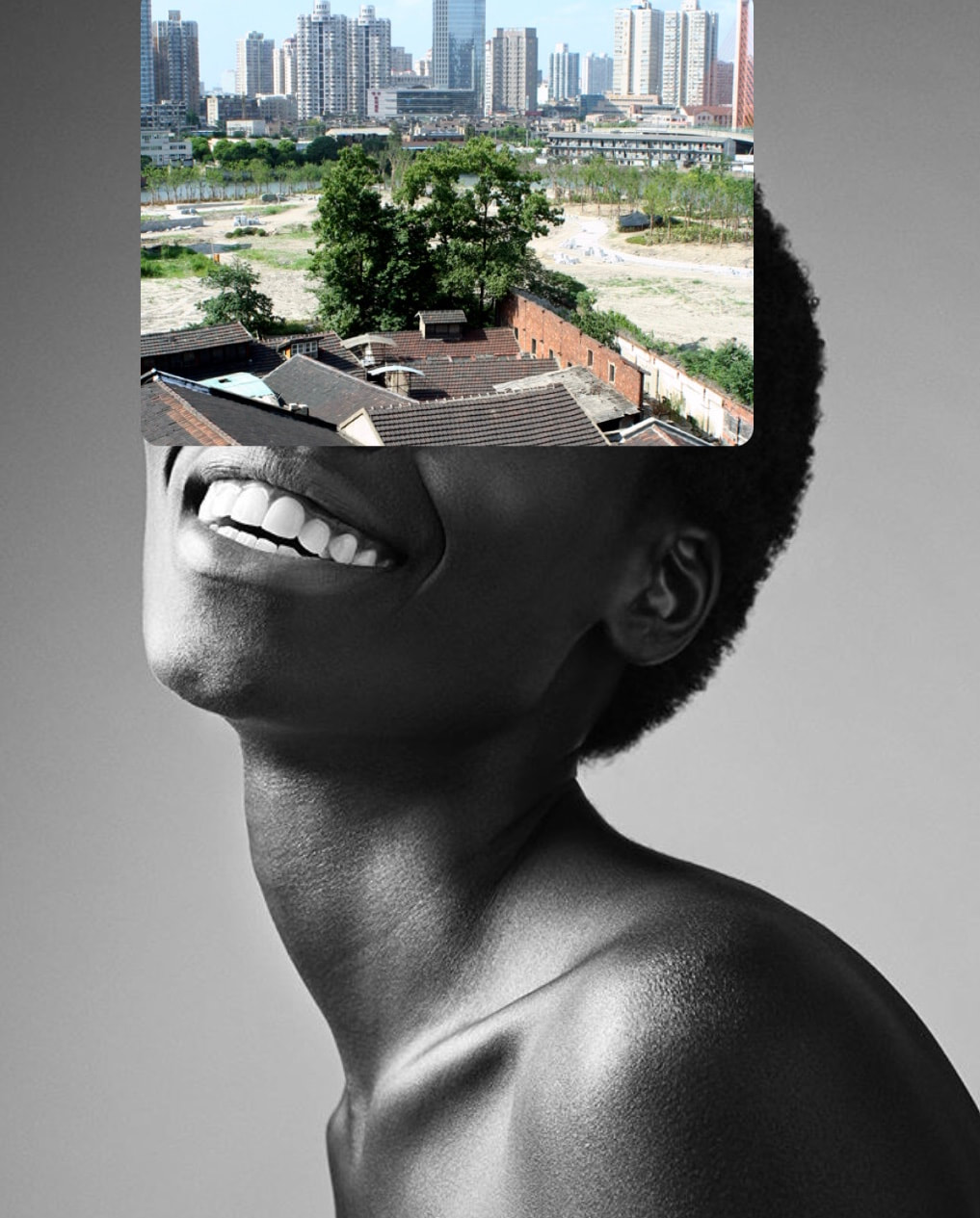
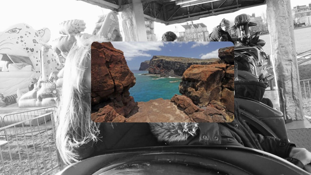
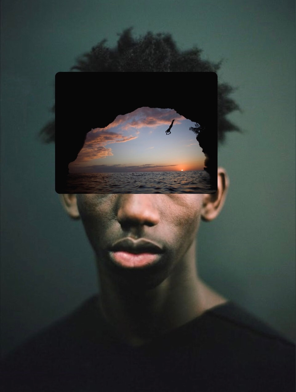
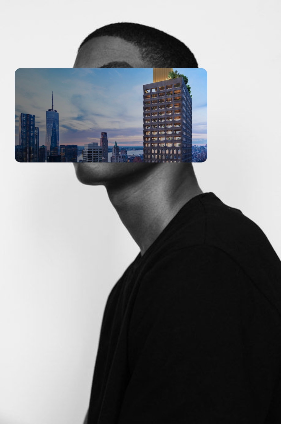
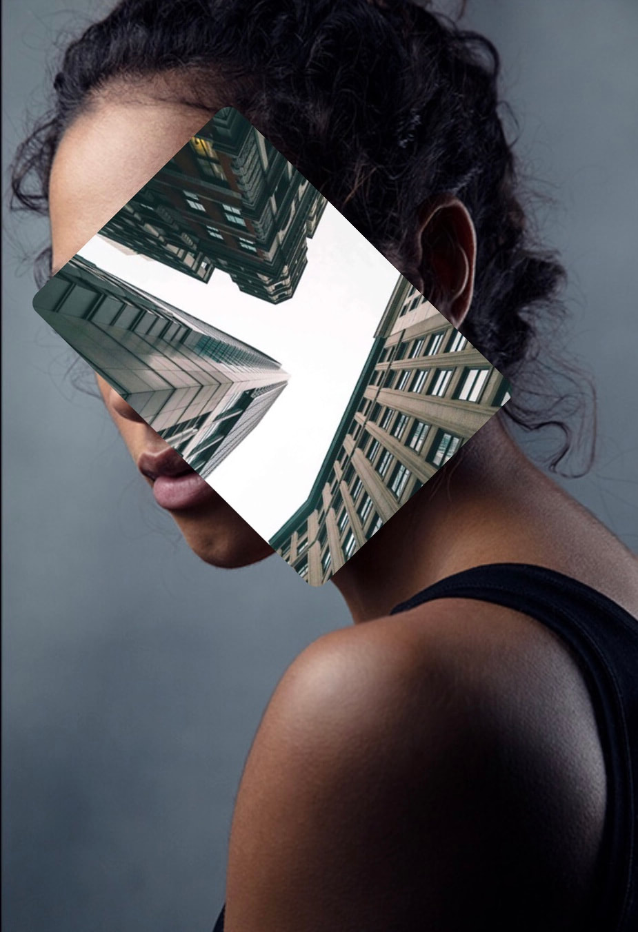
Rachel Isabel Mukendi |
These are a few of Rachel's pieces and i really like them because i love working with portraits and i think it will be interesting to combine portraits and landscapes. Im going to try and line up certain features of the face to elements of the landscape so it flows into the landscape smoothly because its easy to stick a landscape onto a face and leave it but u want it to have a story behind it that that you can relate to almost.
|


|
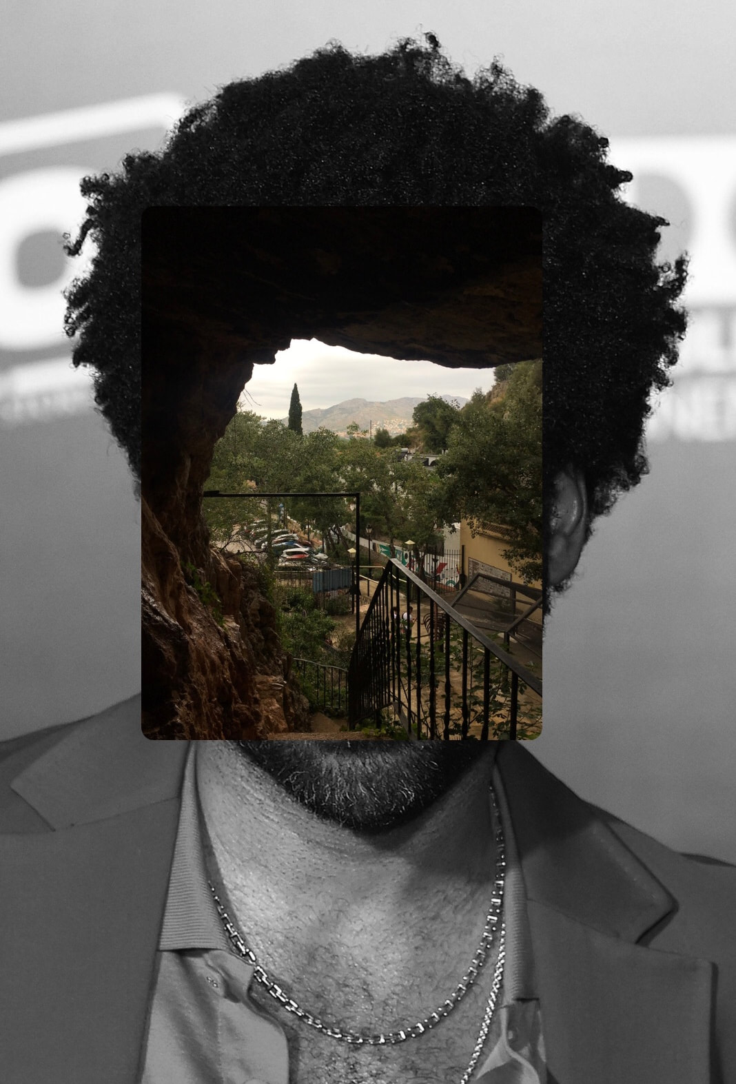
This is John Stezakers work which Rachel was influenced by. She did not feel represented in the photos as they are predominantly white people in the portraits so she decided to respond to them and make them her own by making the images more inclusive and adding landscapes.
|
|


Im going to respond to Rachels work instead of Johns because i like how they are much more vibrant and inclusive. I might try editing them on photoshop or on my phone to combine the images and then print out then print out the final image but i also would like to try doing it in person and having the separate pieces of paper and adding one top of another. Im also going to use my own photos and found images from google maps so i can have very big and wonderful landscapes to coincide with the portraits but i'm also going to make the landscapes more urban. Im also going to play around with colour and decide if i want my portraits to be black and white. Im going to place my favourites onto mount board. Im going to refine it eventually but im not sure how yet im going to see how this outcome looks first.


In the images above these are all of the images I've used to create the images below. The images below are all of the responses I've made to Rachel.
|
|
|
|
These are my final results. I wasn't sure what to do with all the outcomes above this so i traced them all out with a scalpel and made them into a collage, i then added a sheet of see through red glass over the top because i wanted to experiment. Im going to re do this and make it a lot more personal this time and make the portraits of people i know like family and friends and the landscapes of meaningful places. I might make a collage with just all of my family members like almost a family tree and then with landscapes that are significant to them.


These are the outcomes of using my own images of portraits and collages. It was a little more difficult than using found images as when using found images you can look up any landscape and match it to the portrait. However with personal images its harder to align the landscapes to fit the portraits but I like the final outcome.


Collaborative landscape/collage
|
For this activity we had to get into pairs and were given 6 different images and had a number of steps that we had to follow, this included pilling up the images and distorting the photos in different ways such as cutting it in half or taking out certain parts of the image with a scalpel and then at the end we had to share certain photos with our partner and make a collage. This is how my turned out.
WWW: I quite like how it turned out, I like how i didn't have any control over what i was given but i still had to make a collage out of it. I want to try repeating this again. Happy accident. EBI: I would do this again but with my own images next time and not cut out small bits but just tare up my photos as i really like the torn edges. |
|
Sustainable darkroom workshop
|
These are a few of Alices work and just sustainable darkroom in general as just examples. I really would like to make more images like the top left and actually print pictures onto leafs inside of just using leafs to paint onto the paper.
|
|


|
|
Alice Cazenave came in and told us about how she came from a scientific background and changed courses into scientific/chemical photography and did research on how to make more sustainable chemicals to use for photography and developing images. So Alice came in to do a workshop for our class and we started off by making the development by using natural resources like rosemary and vitiamin c tablets etc. We then went out and had to find leaves and different plants to apply the chemicals and make different shapes onto the paper. We then came back and had two different chemicals, one was the developer and the other was the stopper/fixer. You then would put olive oil or suncream or vaseline onto the expired photography paper and you would apply that with the leafs then paint the developer over the top of the leafs and that would give you the outline of the leafs onto the paper then use the fixer to lighten places that were too dark and paint specific I really like how mines turned out and i experimented with a lot of different designs. I think id like to further develop this to making a large collage with lots of small different chemigrams and it be made out of all sustainable resources with all of them the same size. I think the sustainable photography will be used more widely because you use house hold items and its less harmful to the environment. These are my final products.
|


Slides
|
We were given two different slides of different landscapes at random and told to make them your own and to either scrape at them or add colour or cut them in half. I had an image of a church and the other were dark arches from a building. These are the originals.
With the arches one i decided to scrape out the columns and add a yellow tinted background, i also tried it with a purple background. With the church i scraped out the sky and windows and added block colours in the background. This is how it turned out when we were just adding things during class. |
|


|
|
This is the image being projected onto the wall and the second image is putting pieces of card in front of the projected image to make it more blocky and interesting but i didn't get a good picture. The other images of the arches were too blurry and didn't come out well.
|

Making day.
So for todays making day we had 10 hours of making, we are continuing with the landscape theme so I gathered some urban landscapes that I took recently and printed them out.


I was inspired by Stephen Gill to add nature onto the top of printed out images. I went out and got a collection of different leafs and flowers and arranged them on each landscape differently. I mainly focused on almost using the plants as borders around the original image to frame the photos. I really like how it is so 3D and the images are personal to me so it makes me see them differently. This is the first outcome.
Out come 1.


Out come 2.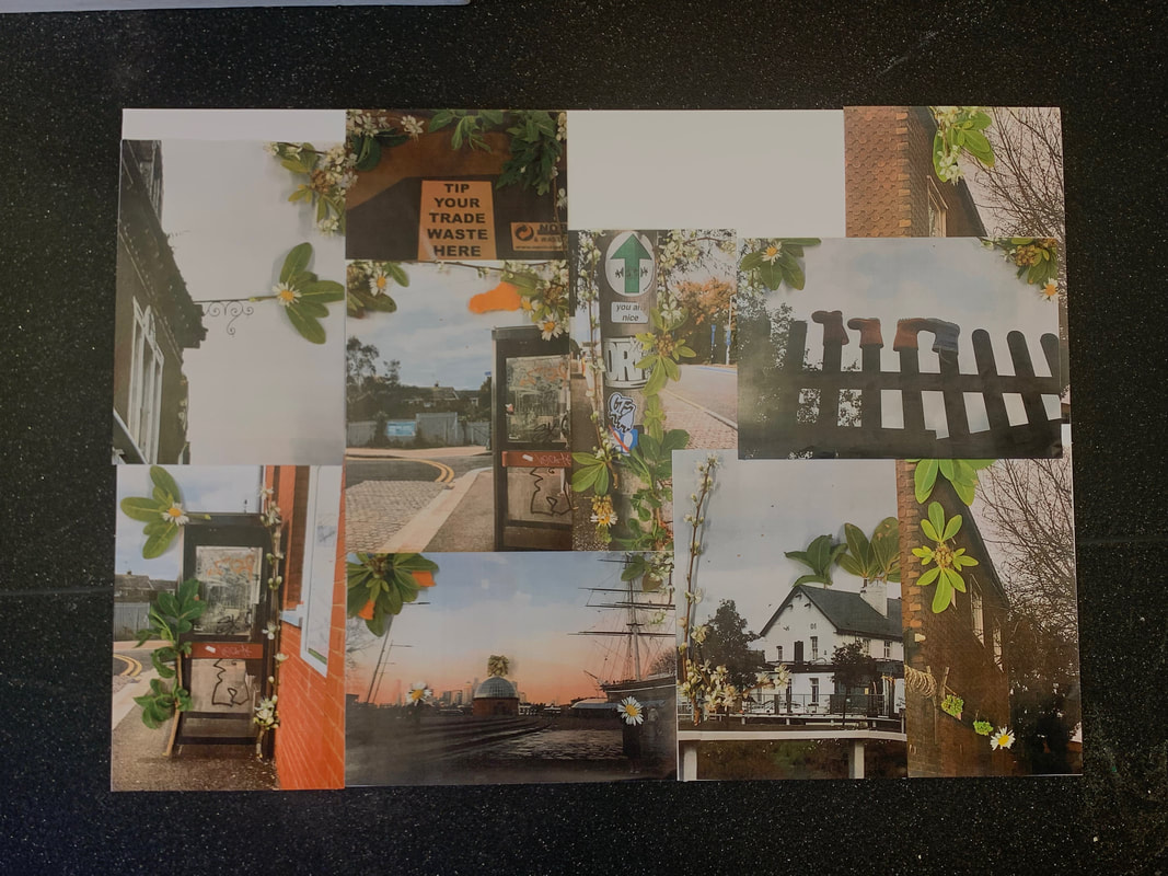
|
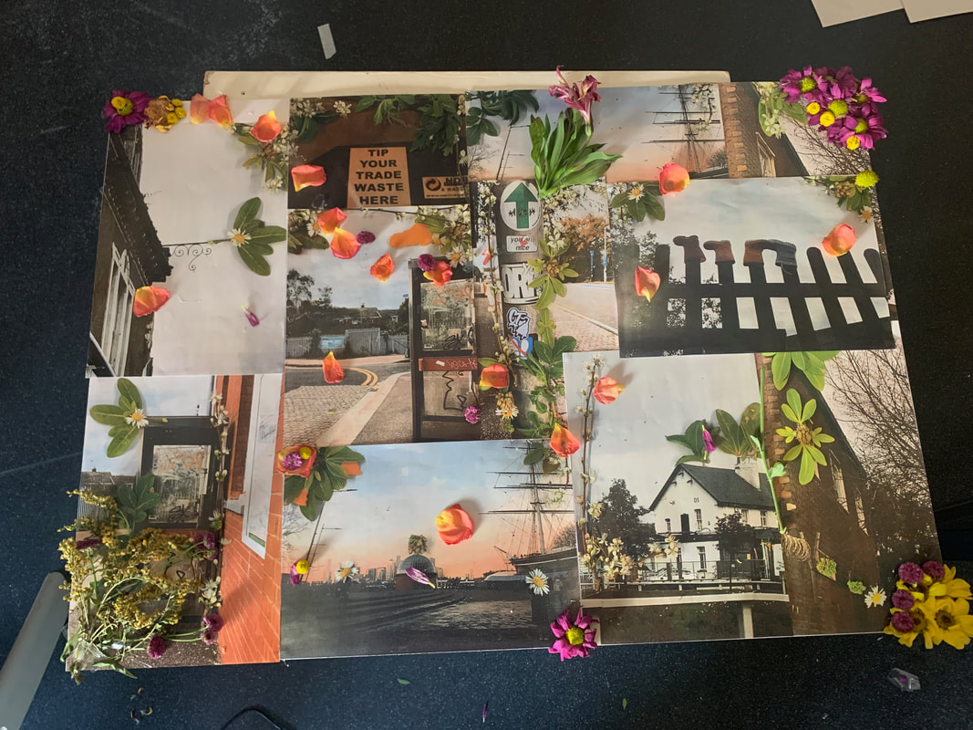
After I took pictures of the plants on the photo and printed them out i put them into a collage on mount board. I was going to take this outside and take images of the collage back in nature but then I decided to get more flowers and add it onto the bigger collage.
|
|
This is the result of adding more flowers onto the collage. I used a hot glue gun to glue the flowers down onto the landscapes, i tried to make it look as natural as possible. Im quite happy with how they turned out, I would like to off had more flowers so i could of done more around the edges to frame it more. I liked how the petals are scattered around.
|
|
Final outcome. |
Then i went outside and photographed the collage back in nature to bring out the flowers even more . I would like to off photograph the individual landscapes with the flowers of back in the landscapes to go back to the origin of the image and see how it was orignally compared to how i constructed it.
|


Another project
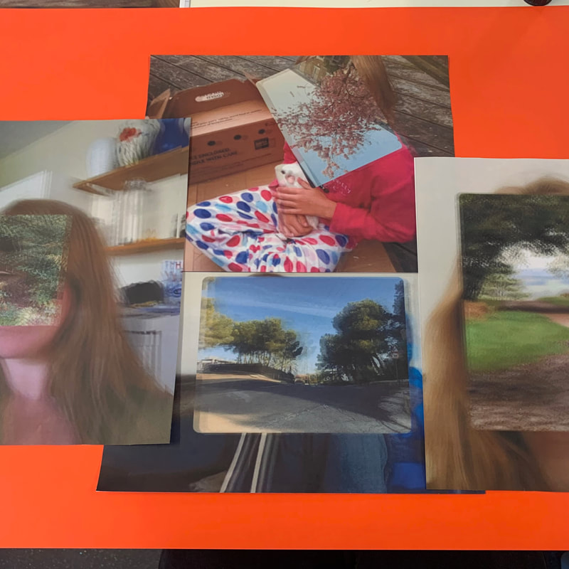
I wanted to make one final project that combines all of my favourite artists techniques. I used corrinne vionett to make the landscapes different from just putting them on the faces. I then Rachel Isabel Mukendis techniques to place landscapes onto portrait. I then made it into a collage


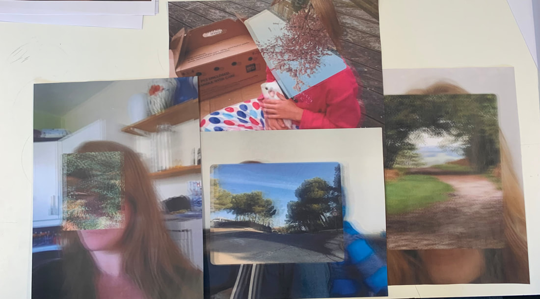
This is the final collage, I wanted to make a final piece that uses some of my favourite artists techniques and using my own images.
If i wanted to improve this further i would do add my own landscapes on top of the collage using acetone to convert it on to the images. |
|
