Edges
All photographs have an edge. We normally take photographs of things in the world. Things in the world don't really have an edge. However when we photograph them we give them edges they don't actually have in reality this is because I have flattened it.


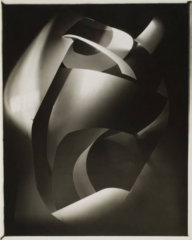
On the left is a photograph from a man called Jerry Reed, on the right is a photograph from Francis Bruguiere
The similarities
* They both look like they are made out of paper
*They both are made out of shadows
*They are both taken in black and white
The differences
*Jerry reeds work is more sharp
*Also there is no grey lightning in his image
*There are more visible edges
*But in Francis Bruguieres work there is a lot of grey light
* His photos are more soft
We could re-make these images by playing around with a couple pieces of paper and crunching them up. Putting multiple pieces of paper onto on each other. Play around with the lighting, and the use of torches and the flash on the camera. Cutting different pieces of paper and then sticking them to others. Its all about trying new things and playing around until you get what you want, and you may think something looks bad while you are taking a picture but when you actually look at it its a work of art.

I chose this photo from Jerry Reed because I love the use of right angles. I would attempt to remake this by using white square pieces of paper and putting them on top of black pieces of paper. I would also use a bright light to really emphasize the brightness of the white and the darkness of the black.

I chose to research this image because I'm really interested into what materials were made to create this image. Also if it was natural light or a phone flash light or a photography light.


Finding the light
1) What did you do?
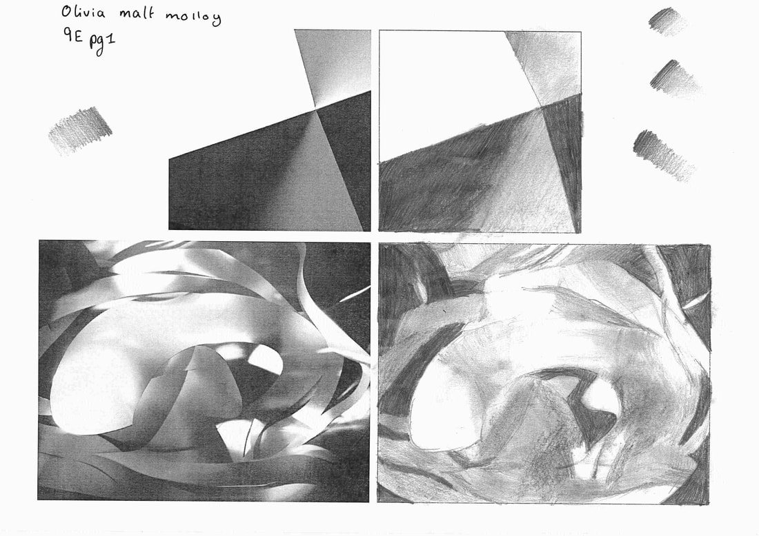
We were given a pencil and two drawings and we had to recreate the drawing, and were told to draw what we saw. We had 10 minutes on the top drawing and 20-30 minutes on the bottom photo. For the first one I measured the lines with a ruler and drew the lines quite hard with the tip of my pencil, but then when I began to shade I used to side of my pencil.
2)Why do you think we asked you to do it?
Because we must practice the skill of looking at a picture for more than a few seconds and learn how to really analyze the the photo and take in every little detail. Also too observe really hard for a long amount of time. It was not about making a really good piece of art and it didn't matter how good your actual drawings was just as long as you can see that you have really taken the time to look and take in.
3) How did it feel?
It felt quite long and a bit hard and frustrating. It felt frustrating because I am not the best at art so I could not get it to look I wanted it to look. After I had finished with it I was kind of proud of it could of done better identifying the dark shades of the photos.
Concertina book


How to make a concertina book
•Fold a piece of paper into eighths
•Unfold the paper
•Fold the paper short sedge to short edge
•Cut the paper
•Unfold the paper
•Fold the paper in half, long edge to long edge
•Fold the paper into a book shape
•Flatten the book
•Secure the pages
A concertina book is named it after an instrument that is looks quite similar too. You can either call it an accordion book or concertina book.


Another way to make a concertina book
|
|
Things you will need
*Piece of paper *Colored paper *Scissors *Glue |
My take on making a concertina book.
I made 5 concertina books, the first two weren't that good but the last 3-4 were actually quite good. One was based on family photos, most of them were made out of all the photos from Rome. So here's how they turned out:


Playing with edges and mirrors
Today in class miss Waldy printed out a few of our photos with playing with scrunched up paper and light and we had to make it into a chatter box. We then went outside in pairs and was only allowed on the ground and first floor.
Chatter box and mirror pictures
Playing with post it notes


Paper edges analysis
|
|
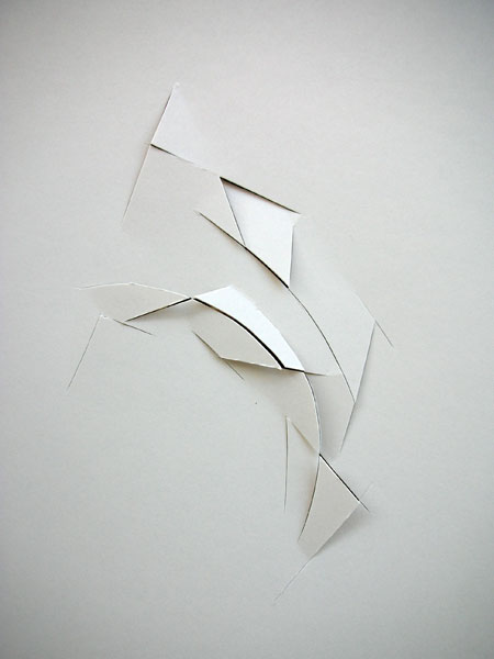
Vjeko Sager Francis Bruguiere
Describe how you think these pictures were made?
For the photo from Francis Bruguiere I think he took a large piece of white paper that he used a scalpel to cut curvy lines at different points of the paper. He then placed the paper informant of a large photography light and crumpled the paper to get different rays of light through the paper.
The picture from vjeko sager was made with a white piece of card, cut with a scalpel in a jagged position, placed on a black background with a harsh white light directly onto the paper
What kind of lines can you see in the picture?
In Francis Bruguiere picture there are quite a variation of lines, for example there are soft curvy lines but then there are straight lines that turn into. a curve. The lines are quite spaced out.
For vjeko sager photo the lines are sharp and jagged , there are curves in the lines but they are still quite chaotic. All of the lines ae in the Centre of the page
Explain the different kinds of lights in each picture.
Francis Bruguieres photo has a wide variety of light. The majority of the photo is black, but then there are parts were there is large white areas and even some grey.
In Vjeko sagers photo it is almost completely white, everything is white except for the cuts in between the lines which is black.
Choose 3 words to describe each of the pictures
Francis Bruguiere
*Smooth
*Chaotic
*Flowy
*Moody
Vjeko Sager
*Bland
*Stiff
*Light
*Sharp
What is your favourite picture?
I prefer Francis Bruguieres photo more because there is more depth to it and it looks like they took more time to perfect the light and the shapes of the individual pieces of paper instead of Vjeko Sagers picture which looks like he got a white piece of paper, made a few cuts with a scalpel and put it in front a black background. Which is perfect if you love simplicity butin this case I would pick Francis Bruguieres based on the variety of color and shapes.
20 photos taken at home that I think represent edges.


Abstract advent images
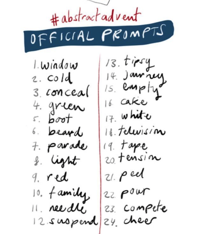
|
Our class was given a task as a homework to take 1 photo of each of the 24 topics given to us, so here is my attempt at that...
WWW: I quite like all the photos I've taken and I think they are unique to my style of photography. EBI: I found it difficult to find pictures for needle, cake, television, tape. The picture for window I thought it would be cool if I took a picture based of the quote 'the eye is the window to the soul' so that's why its not a boring picture of a window. For the tension picture I looked up the definition which was 'the state of being stretched tight' and I thought the shoe laces with the angle looked pretty cool. |


Assessment task-
In the assessment we are in controlled conditions so we cannot talk to each other, I did not find that very hard. However it is comforting to work with someone else and to bounce of each others ideas but I still think I did pretty well at working in silence. At the start of the assessment we had to pick 5 different printed out photographs and go out and take 4/5 pictures of them individually. Now, I did do this and was very proud of the photos I took, but in the rush of me being stressed out I did not resize them and while editing my weekly page ended up deleting them! So I now know to be calm, and work at a steady pace, and resize my photos!
Anyway the second part of the assessment was to take our pictures and cut them up and make them into a self standing sculpture. I found this alright, not really hard but not really easy either. I am quite proud with the end result. I had this picture where it had a long pavement with a checkered pattern, and if you know me you know I love checkers. So I obviously took advantage of that and cut it up and stuck in behind pieces and stuck it around cones. The sculpture itself is quite strange looking but the longer you look at it the more you can see how many different pictures and images are actually stuck onto it.
Then for the third part of our assessment we had to go outside and take pictures of the sculpture around the school. I found this really really interesting because for the original people who took the photos they've made it 2d but then we've gone out and taken pictures of it and put it back into 3d then made it 2d but then made it 3d AGAIN by making a sculpture then made it 2d by taking pictures of it. So basically its a lot of messing around with dimensions.
My favorite photos from the sculpture photoshoot is the first one and the one where the sculpture is balancing on the banister with the circle mirrors in the background because the lighting is so spot on and the colorers are beautiful.


This is the second part of the assessment was an essay. We had to answer questions on both go the photos:
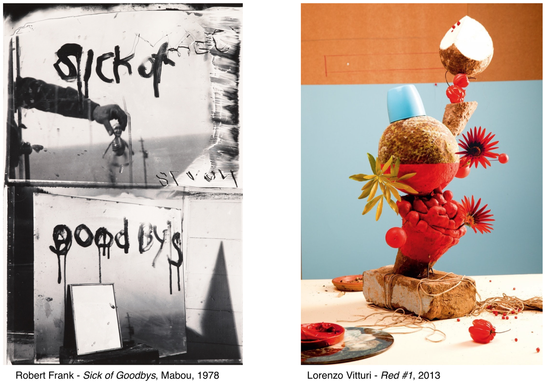
Robert Franks photograph looks like it is two landscape photos cropped on top of each other. The top half has sort of portrait/ still life. there is an arm holding a skeleton doll infant of a mirror with writing on it saying sick of, in quite smudged style, with the sea as the landscape of the photo. Then in the bottom half of the photo is also another mirror with writing saying 'goodbyes'. The background in the big mirror looks like a field with electrical cables going across in the very bottom. Then leaning on top of the big mirror is a smaller mirror with no writing on. In the right hand corner is a sharp shadow. In the Lorenzo Vitturi photo it is split up into 3 part, the red, blue and white which is a table. the whole sculpture is on top of a brick with string around the brick. There are some fruits on the table because they may have fallen down. The statue has quite a bit going on. There's flowers, fruits, lids, ect.
The main similarities of the photos are they are both split into different sections. Frank's is split into 2 main sections, Vitturi is split into 3 main sections. The differences of the two photographs are Robert's is black and white and Lorenzo's is very colorful and vibrant and in your face. Another similarity is both of the photographers have taken the photo so that you cant tell what it is straight away and you really need to look at both of them to see what's going on. Another difference is the textures are quite contrasting. One is quite harsh and painful and the other is more happy.
The types of edges I can see are similar, they both have some very strict harsh edges like the shadow and the mirror in Robert's. The part were the color just stops in Lorenzo's. But then the word 'Goodbyes' is very slanty and a bit all over the place, and the fallen fruit in Lorenzo's shows its not completely perfect and it has its mistakes. Edges are both represented very differently in both photos. in real life in Viturri's there would be space between the sculpture and the wall, because the real world is 3D. But when you take a photo it flattens the subjects and gives it an edge when it becomes 2D. I would ask Robert what was your frame of mind while creating this photo?
Did someone hurt you to make you feel like this?
Why did you make this?
I would ask Lorenzo
What is the underlining message of the photo
Why the brick with all the rope underneath all of the flamboyant colors.
The original name of Robert Franks photo is 'sick of goodbyes'. I would rename the picture:
-Black and white
-Endings
-Reflection: I would rename it reflection because the photo is almost 100% based on mirrors and what is in the reflection of them.
The original name of Lorenzo Vitturi's photo is called 'Red'. I would rename the picture:
-Jagged
-Fruit
-Horizon: I would rename it horizon because there are a lot of block colors with harsh lines separating them.
If I was inside Franks photo I would feel quite scared and uncomfortable. It would feel like a dystopia. If I was inside Lorenzos photo it maybe like being inside Charlie and the chocolate factory. I think Frank made this photo because someone hurt him, and maybe an old friend of his or a partner left him unexpectedly. I think Lorenzo made this photo because he saw the backdrop he had in maybe his office and he may of found the brick and string on the road?
20 minute exhibition
In today’s lesson we were told to go out and take 20 pictures in 25 minutes of the recurring theme ‘looking down’ so we went outside in pairs and got to work. These are the photos I took:


WWW: I really like the different types of focuses I used, for example some are focused on the foreground and others are focused not the background. They are also all very different but all have the same theme which is facing down.
EBI: Some of my photos aren't in focus at all which I hate, I think I could make it a bit more centered some of the photos. I really liked the graffiti on the ground of the smiley faces and just the random rubbish we found on the ground.
Over all I really liked this task, I would like to do another one but instead of facing down we do it facing up.
Colour sculpture.


In todays lesson our teacher showed us some work from Frank Gehry, and we had to make a sculpture based of off his work with different color strips of paper. After we created our sculpture we put them infant of 4 different color backgrounds to see how the different colors would compliment each other. I found it quite difficult at the beginning because I didn't know where to start. Ms' interactions were, don't think about it too much, just create, doesn't matter what it looks like. I quite like how the different color backgrounds add onto the sculpture and when I move the sculpture it looks completely different. I think this links back to the theme of edges using paper has quite harsh edges where the paper ended. I'm not entirely sure why it relates to edges.
Light and shade. 3 week


I'm going to take lots of photos like this as an ant point of view. I really like this idea because it changes the way we actually see the world around us. I did a small experiment on this a while ago and left it behind and when sir said we are doing a project we can play around with and I feel like I could definitely improve from what I did last time.
Last time I came up with this idea I put it into a concertina book and printed the images out and stuck them next to each other but the horizontal line was not matched or inline, so this time I'm going to print them out and line up the horizontal line. Maybe also have a theme of what is in the background of the photo instead of it being random. I quite like it being of nature but I could take a picture and have 3 separate themes and either make 3 separate small booklets or make one big booklet with 3 separate themes that are in their own category. I may also reuse some photos that I took before because I did take some very good pictures.
I took these pictures by turning my phone upside-down and placing it onto a surface and messing around with the focus, either focusing on the foreground or the background.
Threshold Concept cards with your own designs
Mr. Nicholls gave us a task to write out all the threshold concepts and make/ find a picture that goes with the concept. My favorite picture is probably the second concept card because capturing light is such a beautiful thing, because from the naked eye to when you take a picture it will be completely different. Especially when you photoshop it and play with the exposure.
I think the concept that will be most helpful at gcse's will be the first one because it shows that no matter what way you see the world at the end of the day its photography. I think that will be very reassuring to when you might feel unsure in your ability as a photographer.
I think the concept that will be most helpful at gcse's will be the first one because it shows that no matter what way you see the world at the end of the day its photography. I think that will be very reassuring to when you might feel unsure in your ability as a photographer.


