This year we are working so differently because of covid 19 and this means we cannot freely roam around school and be as creative as we used to be. The restrictions that have been put into place means we have to think a lot harder about how we can make our work as creative if not more seeing as we are going into gcse this year. The fact that we only have a small working space and we don't have access to the cameras all the time will probably frustrate us but build a tolerance to not having everything we want all the time. I'm sure artists are used to being restricted due to the fact that not every work place or maybe their home place is comfortable with them doing their art their they would need to find a place where they can freely be themselves. Make do and mend suggests that we have to make do with what we have right now so not being able to have access to all the cameras right away and not being able to leave and take pictures so we must make do with what we have.
Instructions
A list of instructions I use when I take a photograph
*Where to stand
*What lighting I want, so is the sun in frame or the sunlight on another object
*what angle its going to be taken from
If I was going to give someone else instructions I would make them either very clear so they had to do exactly what I wanted them to do or make them kind of brief so they had a lot of creative freedom
My first instruction would be very clear, I want them to stand on their tit toes and take a picture with their phone infant of their face facing forward standing infant of the sun but facing away from it.
My second instruction would be very vague, take a picture of something you love
My third instruction will be clear, take a picture of your shoes facing north at 3 in the afternoon with the grass on the floor as the main subject.
My fourth instruction will be vague, take a picture of the sun at sunrise
My fifth instruction will be clear, take a picture upside down on a big brown door.
Organising bag- instructions
This was a quick project where we had to put everything that was in our bag onto the table and organise it in three different ways.
This was part of the instructions tasks where we were given specific instructions and had to follow them out.
The different ways that I organised it either makes it look like my bag is very full or theres not much in there at all and that a due to the different compositions and different ways of organising.


Adding and subtracting from images.


In todays lesson we were given a random picture of someone famous and the instructions were to make do and mend, we were given a scalpel and glue stick and this is what I came up with. I cut the portrait into thin equal strips. I then rearranged the strips and made her face quite disfigured, then I stuck them onto a a4 plain sheet on paper and left the extra piece of paper hanging off instead of cutting them off to fit the page. I did this to give it a more arts and craft make do and mend feel to it. We then started looking at the Mona Lisa painted by Leonardo da Vinci and we were talking about the image and why it is so famous. A few things we learnt was that the picture was actually stolen on august 21 in 1911 by Auguste Rodin. Also another fun fact that is apparently if you are in the same room at the picture then where ever you stand in the room the picture will always be looking at you.
But a man called Marchell Duchomp drew a moustache and beard onto the painting and this started the trend of make do and mend, taking someone else work and making it your own. This became very popular very quickly because it was sort of making a mockery of very sophisticated piece of art work.
But a man called Marchell Duchomp drew a moustache and beard onto the painting and this started the trend of make do and mend, taking someone else work and making it your own. This became very popular very quickly because it was sort of making a mockery of very sophisticated piece of art work.
Marcel Duchamp & make do and mend.
Marcel Dumchamp was born 28 of July 1887 and died 2 October 1968 and he was a painter, sculptor. He created this L.H.O.O.Q in 1919, his picture uses a postcard reproduction of Leonardo Da Vinci 'Mona Lisa'. It became so famous because apparently from where ever you look at her in a room she's always looking at you. People have said that Leonardo painted his own smile onto the portrait, this could maybe be him exploring gender and sexuality because he was way ahead off this time so it would not surprise me if he was exploring the concept of gender and how it is a social construct. We also do not know who this women is which adds to the mystery. It has been stolen and Marcel Duchamp was the first to make a mockery out of the art by drawing a beard and a mustache which started off the make do and mend trend. The title of this piece in French is pronounced 'Elle a Chad au cul' which in English is 'she has a hot ass' Its an inappropriate expression implying a women has sexual restlessness. Duchamp has taken da vines work and made it his own in a way. I think he added the facial hair to sort of mock davincis work because it is very rare that you see a female with a beard. I believe a ready made piece of art is something that someone has made and we can now use to experiment with, either adding or subtracting. Mona Lisa is a ready made because its just a portrait of a women, you can add so much or take away or dismantle and put back together and make it your own. I think Duchamp idea of ready made was such a revolutionary idea because it meant that artist didn't have to put in a lot of effort, they could just take someone else and add their own spin on it.


Kensuke koike


Kensuke Koike was born in 1980 in Nagoya. He is an artist who cuts out certain parts of pictures and either reconstructs them like cutting out and putting back in different places or cutting out and making a new piece of art with the cut out pictures. I think his work is extremely creative and can do such subtle things to make such a drastic change.
Cutting out and putting back
We were given a portrait with a white frame around it and were told to cut out the square portrait and leave the white frame there to come back to. Once we had traced the picture we had to cut it out in an organized fashion and measure everything we were doing and cut it out, then re organize their face and put it back into the white frame. We were also given different background colors to underneath the portrait to make different parts of the portrait stand out and to give different aura of the painting.


WWW: I really like how it turned out. I think I did cutting out and sectioning quite well and reorganizing the different pieces. My favorite part was on the yellow background.
EBI: I should of kept it on the yellow background because I really liked the way the yellow peaked through. But other than that I think I did really well.
EBI: I should of kept it on the yellow background because I really liked the way the yellow peaked through. But other than that I think I did really well.
|
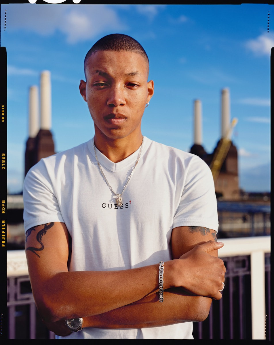
This is an image of dean from the series surpassing. The photography who took this is called Lola Flash, she was born in 1959 in new jersey.
The picture is of a man standing in front of a factory in London starring straight down the lens. He is the main subject of the photo and the background is blurry. It looks like he's standing on a bridge so not much set or lighting just all natural. My initial response to this picture is that he is quite naturally handsome and its like they have just asked a stranger to stand in front of the camera, no preparation or anything. I think the image is representing the black community and how beautiful they are. Its got quite a homely aura to it, looking at the other pictures in this collection I think it is focusing on the natural beauty of the black community and their home towns. If i were to interview this man i would ask him what do you think this collection of pieces is representing and what it means to him. The background contributes to the narrative by being minimalistic meaning they didn't have to use a big studio with lighting and green screen they just went outside and took some photos. The aesthetic of the picture enhances the narrative by making dean the vocal point of the picture and the contrast between the blurry background and the clean cut man in the Centre. This enhances the narrative of being more than the place you came from. Maybe he came from quite a bad area and people would judge him on that and the colour of his skin but this is showing he is more than any of that. If I had to write a headline about this portrait I would name it 'HOME' |


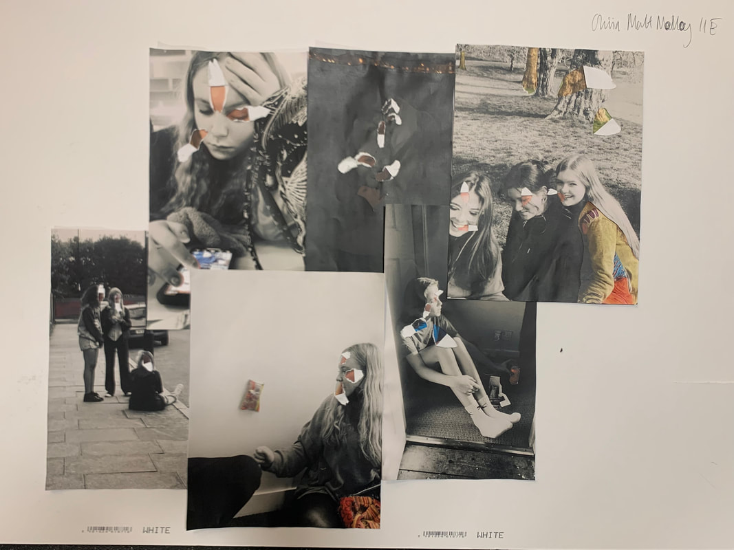
I have been exploring make doing and mending images, and this week we cut out large shapes of this portrait. I took inspiration from Sharon Walters work. You take any image and use a scalpel and trace out either large or intricate pieces of the work and explore the different colored backgrounds. I also used different portraits as the background so different parts if different pictures would shine through. For example there was one picture where there was a couple sitting down and I managed to put that through the mans hand. I want to put news paper text in the background so it goes with the theme of black and white or maybe put the males portrait in color and use different black and white backgrounds coming through.
Artists I'm inspired by in this project: Frank Egloff, Sharon Walters, Hannah Hoch, Google location idea.
Main idea 2:
The artists I'm inspired by this time is Sharon Walters and Hannah Hoch.
The first part of this project i will be using Sharon Walters technique of using a scalpel and tracing out and cutting. I'm going to be using a mixture of found images and my own and play around with the background and layering either with: black & white, block colors, different images and also plan out before what parts I'm going to trace out or just do it as i go along because it could turn out to be a happy mistake or if I don't like it just start again and improve.
The second part of this project is going to be inspired by Hannah Hoch. I'm going to collect all the left over pieces from the Sharon Walters element and turn it into a collage inspired by Hannah Hoch. Finally at the end i might combine the two separate images of the collage and the outlining together and see what I can create.
Sharon Walters
Sharon Walters is a London based artist who focuses on reminding people of the culture of black people and reminding everyone of their pure natural beauty. She does this by making most of her work around black women and outlining their natural afro to really emphasize how beautiful they are. Her work is handmade, she gets a portrait either a found image or one she's taken herself and she uses a scalpel so trace the parts of the picture she want's to cut out and mainly uses other images as the background or block colors that peaks through the cutouts she's made. This task was quite fun, We were given a portrait and given examples of her work and we had to recreate and make it our own. Sharon Walters is a London based artist who focuses on reminding people of the culture of black people and reminding everyone of their pure natural beauty. She does this by making most of her work around black women and outlining their natural afro to really emphasize how beautiful they are.
Here are some examples of her work.
Here are some examples of her work.


First response to Sharon Walters


Developing my response.


This is what I did in todays lesson, a few of the new pictures i've added I cut out parts off from home because I wasn't in for a while so I brought some equipment from amazon so I can work at home.
This is my response to Sharon Walters and i'm still experimenting with the different colours. I think i'm going to make the the background colours all similar to make them have something in common for the project and it makes all off them link together.
WWW: I like some of them with the orange stripped background because it gives them the eery aura that i'm trying to give some of them. For example the last one i really like with the slits in the lips and the big hair. Also the first one because I think it makes the image look more 3D.
EBI: With some of the photos like with the sixth one i'm not too keen on it because its got a lot going on and its quite chaotic so i probably wont use it or if i do make the background colour a block colour instead of a patterned background.
Messing around with backgrounds.


In todays lesson I was playing around with the different backgrounds and how it changes the meaning and feeling of the photo. So I found that i liked an actual image instead of block colours for the background of this specific piece of work, and the background image of this was a women looking into the distance and i really like how i incorporated her face into the different images and how some of her facial features fit into other obscure places.


This is the other background image i tried with the *The Pay Gap Campaign* speech. I like this quite a lot because the yellow really makes the image pop and in some of the images you can read some of the writing, i think in the future if i do this again i would make it so the text is easier to read and portrays a deeper message.
Some people did this with their portraits and others did something like this
|
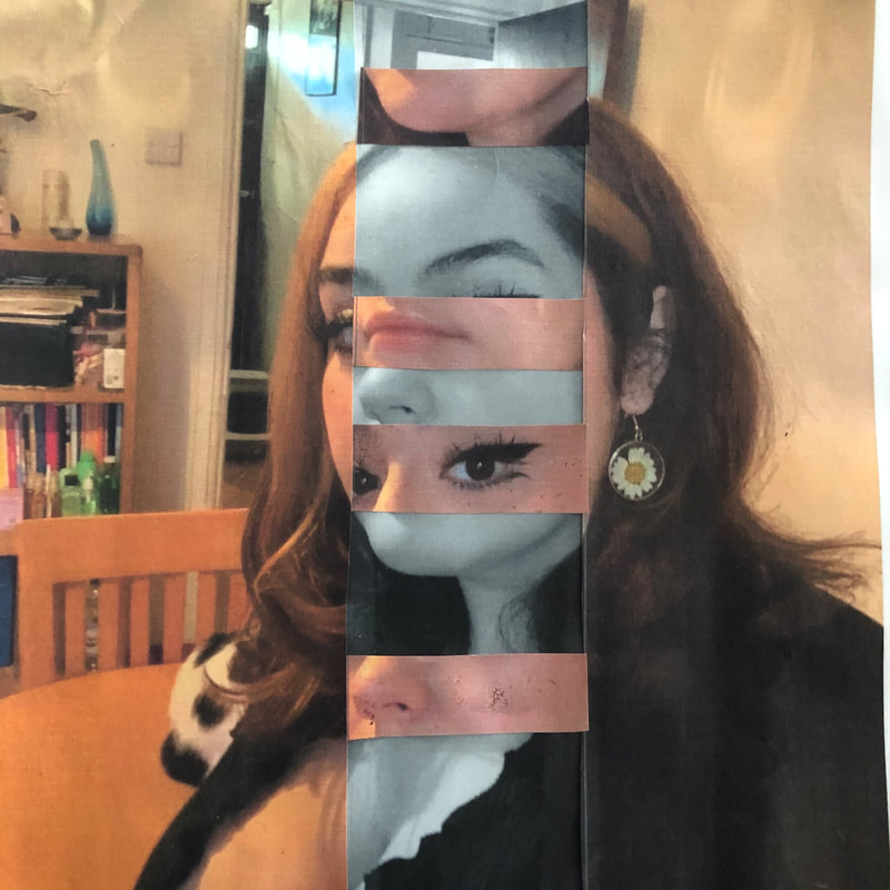
This is an example of what I did in the lesson, I forgot to take pictures but ill describe what I did. We were given a piece of cardboard paper and a a4 portrait. We then glued the portrait onto the cardboard and used a scalpel to cut the lines, you would start at the bottom and drawing thin lines up to the facial features and tracing the features then you had to stand them up at the bottom and it would make the image look completely different.
When I did this I found it kind of hard because I didn't let the glue dry so it was very difficult to cut out the thin lines with out the paper scrunching up. I think I did mine of a beautiful black women with afro and I cut out her afro and made it stand up with the rest of her features. I didn't take any pictures because I forgot to but I was quite proud of my work. |
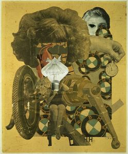
Hannah Hoch
|
This week we are starting to look at artists who specialise in collages, one of those artists is Hannah Hoch. She is a German artist who was born in 1 November 1889, and she created this collage in 1920 during ww1. Its called beautiful girl and in lesson we had to talk about the form, process and content. For form you had to describe what is going on in the picture, I wrote that there is a lot going on in this image and a large variety of different pictures cut out and made into one piece. All the pictures are quite old fashioned and this is due to the time it was made. There are separate pieces of female body parts such as a body, hair and then here is also a lot of images and ideas relating to cars such as car brands and tires probably out of a car advert. The tones are quite muted and vintage.
|
Then for the process you would talk about the materials and how they made this piece of work. The artist has used lots of different subjects of pictures and maybe glued them together. Used a camera to take the picture and has equal lighting around the image except for the lightbulb which is brighter and quite eye catching. Its 2D and the pictures look lie they are from different magazines and not taken by her. Now the finally the content is about doing research about the image and the artist. The image is related too factories and links back to the idea of women working in factories while the men were fighting in the war. The light bulb above the women body is representing the fact that women have ideas and they are equal to men because back then was when the suffragette movement was starting and women were trying to get the right to voting and basic human rights, this relates to why a lot of Hannah's pieces are about female empowerment. The brand in the background is BMW which is a German brand and so is Hannah so relates it a bit back to her country. In the picture there's quite a large contrast between the idea of women having ideas and not just being pin up dolls and then also an element of comparing women to cars and objectifying them, most cars and boats are actually named after women emphasizing the fact that women should be seen and not heard or something to own and show off.


These are my two responses to Hannah Hoch and making a piece of my own inspired by her. The first one I did at home and made it out of a counselling mindfulness magazine I found and cut out all the different eyes I found in the images and tenth women and darkened people was actually one imagine but then I cut around her and layered a more colorful imagine behind her to emphasize the idea of her being in her own creative world while the people around her judge or envy her. In the second imagine I made I didn't end up sticking it down but I wanted to cut out every other window in the flats and layer more images behind that so that's an even better if for next time to actually finish it. But while making this image had there song park life stuck in my head and the block of flats and the old men gave kind of reminded me of the song and the old men talking about their life before and reminiscing.
More responses to Hannah Hoch


This is the Hannah Hoch part of my main idea 1, I've put a spin on what i'm going to do, I was playing around with different ways to make collages out of the many photos i have. The first two images are the first draft and i was thinking of putting larger eyes and lips onto smaller faces to give a distorted look while some photos also have some element of Sharon Walters in them because of the outlining of key parts of their body.
What i ended up doing was cutting out a large leather jacket which gave structure to the work and as i had already cut out hair i decided to make a sort of contorted body. I made a smaller collage of all the faces to create one large face and put the bigger eyes and mouth on top to have a reminder that it is Hannah Hoch because that was a common thing she did in her work, using large facial features and messing around with how they changed the energy of the art work. I then played around with using longer cut outs of models, like their full bodies instead of just their heads to fill up the space of the leather jacket. I didn't like how clumped together it all looked so i thought i could either cut out a necklace to make a neck shape more prominent or make the image 3D by safety pinning an actual necklace onto it.
Now i think i'm going to start working on my second main idea and then if i think of anything new about this and i can come back to it.


This is my final image of the Hannah Hoch part of my project. Im quite happy with how it turned out almost like a portrait collage which wasn't what i was going for in the start but its where i've ended up and i'm quite pleased. I think the green part on the right of the hair should of been cut out but besides that I think its okay. I stuck all the pieces onto a green cardboard background and ive taken inspiration from Hannah Hochs work and then made it my own by making the collage into a abstract portrait.
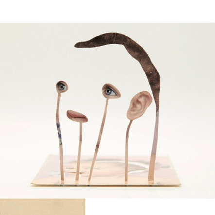
Frank Egloff
Frank Egloff was born in Bonstern in 1948 and grew up in Connecticut, his artwork is very abstract and every odd. He takes 'normal' portraits and uses different tools to make the picture abstract, such as cutting the image into 4 or more identical shape pieces and moves them around to almost disfigure a puzzle. He also outlines, similarly to Sharon Walters, different shapes and patters, and other times makes 3D standing sculptures of a section he's cut out of a photo and makes it stand up right and playing around with different lighting to make shadows. Here are a few images I'm going to take inspiration from.


We then had to pick out some portraits and make a response to them and here's how mine turned out.


These are the results of my first outcome in response to frank. Im now going to further respond but with my own images and make a collage. These are the original images.


|
This is the final result. Im quite happy with it. I printed out the original pictures and then printed the images in black and white. I then tour up the back and white version and used a scalpel to cut out specific pieces then stuck that onto the coloured one and aligned it with each other. I then repeated that with every image and made it into a collage.
|
|
Her Instagram @ is dreiaisdead. I contacted her to ask if i could use her images and she agreed, this is the outcome in response to frank egloff
We now have to pick another artist and compare the two artists work. I picked Alma Haser.
I am a big fan of Almas work because they are also very uncomforting and when you first look at their art there's a sense of normality but then you look closer and normality is stripped away by the unnerving sense of the un known, and how most of the time you look at someone's eyes first and that is tawn away by the fact that Alma messes around and contourtes the image making it very abstract. This is quite similar to what Frank does, both taking something normal and making it unknown or unnatural. But uses quite dull tones and old fashioned looking portraits where as Alma uses modern and bright portraits to add to the effect of the contrast between modern and normal and then abstract.
I am a big fan of Almas work because they are also very uncomforting and when you first look at their art there's a sense of normality but then you look closer and normality is stripped away by the unnerving sense of the un known, and how most of the time you look at someone's eyes first and that is tawn away by the fact that Alma messes around and contourtes the image making it very abstract. This is quite similar to what Frank does, both taking something normal and making it unknown or unnatural. But uses quite dull tones and old fashioned looking portraits where as Alma uses modern and bright portraits to add to the effect of the contrast between modern and normal and then abstract.


Maurizio Anzeri
Maurizio Anzeri is an artist who finds images and then remakes them and makes them really abstract and uncomfortable and really alien like. He does this by using needle and thread and sewing the paper over and over again with different colored threads. Here are a few examples of his work that I am really fond off.


We then had to make a response to his work with portraits we found and this is how mine turned out.
The first image u made was the one on the left, I kind of like it but not amazingly, it was my first try so I'm not surprised it didn't turn out amazing. I didn't really have a plan with what I was doing with it and just drew random dots around the face.
WWW: I quite like the color I used and how the string is a continuous line around the triangle.
EBI: The lip threading was a lot neater. If I had an actual idea behind what I was doing and thought about it more than rushing it. Outline more key features of her face like her wrinkles or her hair instead of random shapes around her eyes.
The second response to his work I made on the right is a lot more effective. While I was making it I was quite zoned out and then when I had finished I finally looked at it properly I was kind of scared of it to be honest. Like it can be interrupted in many different ways.
WWW: again, continuous line, The colors go quite nicely together. But the concept is kind of scary like I see it as maybe a couple being repressed together, maybe an arranged marriage. But I liked the way I outlined the clothes.
EBI: Before I carried on the thread was really rushed around the hand and the thread was quite loose. But then i redid it and carried on and made the thread a continuous line.


Matt Lipps
Matt Lipp's was born in 1975 Oakland California. He specializes in sculpture and collages. He cuts out different pictures and puts it all together and makes it stand turning it into a 3D looking piece due to the shadows in the background. He then arranges the pictures with the smallest in the front then gradually increasing in size the further back they are. He also messes around with sizing so the first product would be A4 but then he would maximize it to make it life size which makes it almost daunting to think about seeing in real life because some of his pieces can be sort of ominous.


Daniel Gordon.
|
A quote from the new York times about Daniels work: "Involves creating figurative tableaus from cut paper and cut-out images that Mr. Gordon then photographs. In addition, he seems motivated by a deeply felt obsession with the human body and the discomforts of having one."
These are a few of my favorite pieces from him. |
|


|
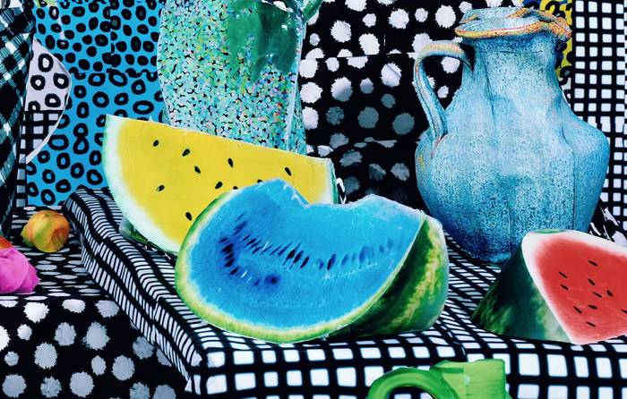
In this image I can see three slices of water melon, the skin being its normal color on all three, but then on one of them the red part is blue and on another the red part is yellow then the final piece is red. There is also a jug on the background and there is a lot of black and white and squares or dots. Lots of different textures.
|
I think this was made from cut outs of different images from a magazine like the backgrounds of pictures for all the different textures and then a food magazine with the water melon and then a lot of editing to make the colours very unnatural.
I think the artist has used the skill of cutting and subtracting from the original and then clumped them all together into a large collage
Three words i would use to describe this image is chaotic, unusual, uncomfortable.
Three questions i would ask Daniel about this work is
1) What inspired it?
2) Where did you know when to stop and when it was too much?
3)How many layers are there in total from the first sheet you in the back to the watermelon in the front?
Responding to Matt Lipps
Recently we have been responding to Matt Lipps and we have been cutting out specific images from magazines and keeping it to a certain theme. We cut out images and then use a scalpel to trace it and then glue it onto a piece of cardboard and then cut that out, this will help the image stand when we are organizing the collage and moving them around for either a different back drop or rearranging the sizing of the subjects.
My original theme started with growing old because I couldn't really find a theme for the magazine I had and ended up picking a bunch of different aged people and doing a sort of timeline. But I then used a different magazine and now my theme is like: performing / dance / self expression.
I have stuck all my pictures onto cardboard now I just have to take pictures and arrange them in a abstract way that compliments Matt Lipps pieces.
WWW: what's going well so far is I really like all the images I chose and I've done quite well on cutting out and keeping the lines neat and tight.
EBI: If I had more images, I'm probably going to get more images and then I just need to take pictures and think about lighting and placement.
Collaborative collages


Today we were each given 4 whole images and the first step was to fold the paper and rip a shape out of that image
Prison Photography
Activies 1/2 Documentation
I am interested in prison photography because we get an insight into some elements of that prison, also if the prison is doing creative workshops that also shows us that they do care about the rehabilitation of their inmates instead of wasting however many years of their life. Its also interesting to see the work that the in mates come up with because this helps us understand their situation or even mental health state more clearly and can be very therapeutic to some people. Being in a COVID lockdown is quite similar to prison because for the obvious reason, we ae not allowed out or to socialize and see our family and friends. Its difficult for everyone but extremely difficult for people who suffer from mental health problems because you are alone and depending on your house hold it will have an huge impact on your mental health. This is similar to prison because some if not most prisons are not more supportive to their inmates and treat them like everyone else even if it is clear they need extra support.
Photography can be used in prisons to help rehabilitate inmates because its a subject that requires a lot of attention and time, like thinking of all the different aspects of when you are taking a photograph like the lighting, what's in frame, what is the fore ground and background and the main piece of the image and more. This helps inmates develop multitasking and further thinking into what they are doing which can help in all elements of life.
It may be difficult to practice photography in a prison setting because the inmates are more than likely not allowed outside and they may be hard to teach and guide which can make things quite chaotic and may lead to like indoor riots. The workshop would have to consider that some inmates may not be let out of handcuffs for their safety and others, they aren't allowed to roam freely and find what they want and take pictures there would probably have to be selected areas for different groups and this might make it difficult for the inmates to actually connect with photography and the good that it can do for people.
We were given seven images and asked to sort them into certain genres.
|
Number one: Nature
|
|
|
Number two: Architecture
|
|
Number three: Portrait
|
|
|
Number four: Still life
|
|
Number five: Fashion
|
|
|
Number six: Landscape
|
|
Number seven: Travel
|
|
Activity 3 Genre Photography Treasure Hunt
Part 1
For activity 3 we were given a list of 20 subjects to take photographs and we had roughly around an hour to take pictures. We had to think about the lighting, focus, composition, backdrop, point of view and framing of photo.


1) The view through a window- In this picture I tried to line up the window frame and set it as the frame of the picture. I also made the white frame the thing that was in focus and the background blurry. I think I could of lined it up a bit more but other than that I quite like it.
2) Your reflection in a shiny surface- We did this lesson in the morning so I was in my pjs so tried to get my kitten into the reflection of my oven. Even better if I got a clearer photo and crop out my hands on the right.
3) The back of someone's head- This photo was taken quite quickly and quite basic. Even better if I went back and re did it with a different background, a more clear background and arrange the framing better but I didn't want to distract my mum for too long.
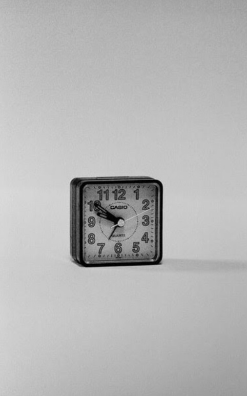
4) A small object shot from a low angle against a plain background- I kind of like this photo, I think i could played around more with shadows and the lighting going onto it.
5) The palm of someone's hand with the word 'help' written on it- I like this, I think it was more creative than just writing the word help on my palm. I wanted to get a family member to take a picture so i could have the word going across both hands but everyone was busy. I think that would look quite good with a dark background and a bright straight light beaming down kind of highlighting it.
6) A smile- This is a picture of my mum because she has the best dimples. I quite like this photo because its quite simple but says a lot. I think i did quite well on the focus on the main part of the image and the background being blurred.
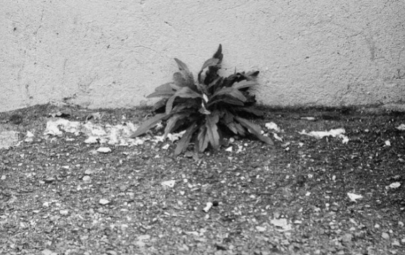
7) A plant growing in the wrong place- I love this image because the main subject is in clear focus and the background blurred emphasizes the weeds in the front that are not meant to be there and should be on the other side of the little ledge
8) A cracked paving stone- This sort of also goes hand in hand with number seven because there is a plant growing through the crack. Not really much I can think to improve on with this one to be honest.
9) A pile of clothes- Really good focus on the subject but maybe a clearer background to make it look more professional or if we are going for a normal vibe then I think the background is ok.
10) The creases un a bed sheet shot from above-Kind of hard to tell what your looking at but its a cover and a bear.
11) A close up photograph of a computer, phone or television screen-Could improve on the focus level of the picture and framed it better
12) A map-The concept of the photo is in focus which is surprising seeing as the kitten looks like it should be the main focus and I thought it was more interesting than just the map on its own.
13) The spine of a book-Quite basic, could of gotten one of the specific books more in frame than the others.
14) The inside of a fridge-Could of framed it better and not got that top right part in it.
15) The sky- Really nice picture, would look better without the reflection of the curtain on the window. Also if the fence went off into the bottom right corner of the photo.
16) Part of a fork- Should of lined it up with some sort of frame of the photo. But i like the way its standing up because disfigured.
17) The sole of a shoe- I really like the reaming of this and how the lines of the walls are bringing the photo into a corner and the main subject is in the corner. I could of lined the lines up on the wall better with the edges of where the picture starts, so the closest bit to the floor could of been coming into frame from bottom left corner.
18) The ceiling of your bedroom as you are lying on the floor- I quite like the shadows of the lamp onto the vines, again the vines should of come off of the opposite corners of the frame.
19) A photograph of a photograph- I can play around with the different types of focus with this and i could move my iPhone camera right into the disposable cameras lens.
20) A glass of water- This image looks quite strange because you cant really tell the size f the cup but its annoying how the water is ever so slightly lower than the straight line in the background because they could of lined up perfectly.
2) Your reflection in a shiny surface- We did this lesson in the morning so I was in my pjs so tried to get my kitten into the reflection of my oven. Even better if I got a clearer photo and crop out my hands on the right.
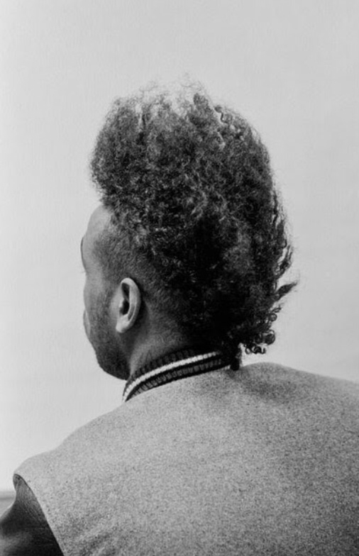
3) The back of someone's head- This photo was taken quite quickly and quite basic. Even better if I went back and re did it with a different background, a more clear background and arrange the framing better but I didn't want to distract my mum for too long.
4) A small object shot from a low angle against a plain background- I kind of like this photo, I think i could played around more with shadows and the lighting going onto it.
5) The palm of someone's hand with the word 'help' written on it- I like this, I think it was more creative than just writing the word help on my palm. I wanted to get a family member to take a picture so i could have the word going across both hands but everyone was busy. I think that would look quite good with a dark background and a bright straight light beaming down kind of highlighting it.
6) A smile- This is a picture of my mum because she has the best dimples. I quite like this photo because its quite simple but says a lot. I think i did quite well on the focus on the main part of the image and the background being blurred.
7) A plant growing in the wrong place- I love this image because the main subject is in clear focus and the background blurred emphasizes the weeds in the front that are not meant to be there and should be on the other side of the little ledge
8) A cracked paving stone- This sort of also goes hand in hand with number seven because there is a plant growing through the crack. Not really much I can think to improve on with this one to be honest.
9) A pile of clothes- Really good focus on the subject but maybe a clearer background to make it look more professional or if we are going for a normal vibe then I think the background is ok.
10) The creases un a bed sheet shot from above-Kind of hard to tell what your looking at but its a cover and a bear.
11) A close up photograph of a computer, phone or television screen-Could improve on the focus level of the picture and framed it better
12) A map-The concept of the photo is in focus which is surprising seeing as the kitten looks like it should be the main focus and I thought it was more interesting than just the map on its own.
13) The spine of a book-Quite basic, could of gotten one of the specific books more in frame than the others.
14) The inside of a fridge-Could of framed it better and not got that top right part in it.
15) The sky- Really nice picture, would look better without the reflection of the curtain on the window. Also if the fence went off into the bottom right corner of the photo.
16) Part of a fork- Should of lined it up with some sort of frame of the photo. But i like the way its standing up because disfigured.
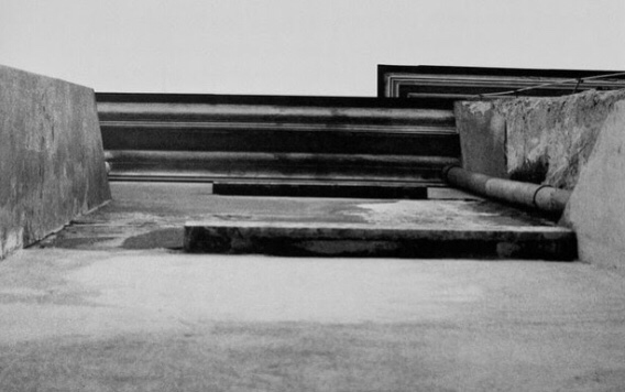
17) The sole of a shoe- I really like the reaming of this and how the lines of the walls are bringing the photo into a corner and the main subject is in the corner. I could of lined the lines up on the wall better with the edges of where the picture starts, so the closest bit to the floor could of been coming into frame from bottom left corner.
18) The ceiling of your bedroom as you are lying on the floor- I quite like the shadows of the lamp onto the vines, again the vines should of come off of the opposite corners of the frame.
19) A photograph of a photograph- I can play around with the different types of focus with this and i could move my iPhone camera right into the disposable cameras lens.
20) A glass of water- This image looks quite strange because you cant really tell the size f the cup but its annoying how the water is ever so slightly lower than the straight line in the background because they could of lined up perfectly.
Taking images- Framing
Part 2
The first list of images we were told to go take pictures of was made by the other class and we had 20 to 30 minutes to take 20 pictures.
Pasta, Bricks, An open book, Clutter, A rolled up pair of socks, An item of jewellery, A shadow, Toothpaste, Food items of the same colour, A birds eye view of a hair brush, A shoe in a sink, A window, The top of someone's head, A photograph of a picture in a frame, A left earphone, A photograph of someone taking a photograph, Spare change, The wheel of a car, A blank wall, A right foot.
Pasta, Bricks, An open book, Clutter, A rolled up pair of socks, An item of jewellery, A shadow, Toothpaste, Food items of the same colour, A birds eye view of a hair brush, A shoe in a sink, A window, The top of someone's head, A photograph of a picture in a frame, A left earphone, A photograph of someone taking a photograph, Spare change, The wheel of a car, A blank wall, A right foot.


So over all i like the pictures I've taken, its annoying though because i take the pictures on my phone and the framing is how i want it to be on my phone but then upload it to Weebly and it crops the image more. My favorite image is probably the clutter, because I didn't move anything and i really like the lighting. I would try cropping out the reflection of the mirror in the picture.
The second selection of images were made by the classes ideas and we were given roughly 30 and had to pick 15 and go take images. I picked these
A corner of the room, Something colorful, Something that makes you happy, Something that keeps you warm, Drink bottle in a sock, View from your bed, Something that brings memories, The sky, Close up of jewelry, Something out of place, Bowls on top of each other, One half of a whole, Inside a washing machine, Front door.
A corner of the room, Something colorful, Something that makes you happy, Something that keeps you warm, Drink bottle in a sock, View from your bed, Something that brings memories, The sky, Close up of jewelry, Something out of place, Bowls on top of each other, One half of a whole, Inside a washing machine, Front door.
Part 3


I prefer these selection of images more because of the color variety. My favorite image is probably the ring because of the shadow of the sunlight hitting the gold band is really beautiful and its in the center of the image and not really much to say on framing because I cut out all the excess bits and bobs. I also really like the 'something colorful' because i did quite well on the framing and not getting the white part of my wall into frame.
EBI: On the 'water bottle in sock' I would make the desk come out of shot and in line with the two bottom corners and get the top part of the bottle in. With the 'something out of place' I put a book in a sink and I could of aligned that better with the top part of the image being a straight line instead of slanting off.
EBI: On the 'water bottle in sock' I would make the desk come out of shot and in line with the two bottom corners and get the top part of the bottle in. With the 'something out of place' I put a book in a sink and I could of aligned that better with the top part of the image being a straight line instead of slanting off.
Activity 4 Questions and Answers
Genre means the category that an image fits into and the main photographic genres are portrait, fashion, still life and architecture. When we look up landscape photography we expect to see a view and being able to see the picture get smaller in the distance. It would be difficult for prisoners to take landscape photos as they are more than likely not allowed out of the building for safety reasons. Looking at my 20 photos they are mainly portrait with a few landscape but I think this is because its easier to get what you want into frame when your doing portrait especially if its long and your taking a photo from in front of it instead off above. An infinity background is a background with no angles so shadows don't collect up at then back but it looks like a long white sheet of paper hung up and then draped down onto the floor then becoming flat on the floor.
Activity 5 Rules and Restrictions
Choose one genre of photography (e.g. Portrait, Landscape, Still Life etc) Try to create several photographic examples of this genre observing the following restrictions:
a) You must be sitting
b) The final image must be black and white
c) You can only photograph another photograph
d) The image must be square.
I thought this task would be kind of easy and then i saw the 'only photograph another photograph' and it threw me off a bit. So for some of the images I took a picture before hand and then printed it out then held it up in front of the same setting. Then with others I edited it in.
Activity 6 Collection Of Genres
Our challenge is to either stage a photograph or make a collage that contains references to as many genres of photography as possible.
Re-doing collages
Okay so in todays lesson we were asked to re do our previous collages, and I used a dew different images and tidied it up a bit. The first image was my first draft of my second attempt and WWW: I've got a lot of different genres and and the images are quite nicely laid out. EBI: Framing is very wide and there's a lot of map space. So I used plain paper to crop the image in real life so I can just take a square photo on my phone an it makes the collage just look neater and there's more going on in a smaller space instead of there being large empty segments.

Instructions for experimenting with a 'found' photograph
Instructions:
1) Hold the photograph in one hand and photograph it with the other
2) Take a photograph of your finger pointing at something in the photograph
3) Take a photograph of your photograph with light reflected on the surface.
4) Take a super close-up photograph of your photograph (so that the edges are not visible)
5) Photograph your photograph in an unusual location
6) Photograph your photograph in a book
7) Photograph your photograph peeking out of someone's clothing
8) Put the photograph under a chair leg. Take a photograph of it
9) Cover the photograph so that only a small part of the image is visible, take a photograph.
10) Ask someone to hold the photograph in front of their face, make a photograph
11) Write a message on the back of the photograph, photograph it
12) Photocopy your photograph (enlarge by 300%)
13) Photograph the photocopy on top of the photocopy
14) Make a paper airplane from the photocopy, fly it, photograph it where it lands.
15) Scrunch the photocopy into a ball (image on the outside), photograph it
16) Submerge the photograph in water, photograph it
17) Tear the photograph in half. Place the two straight (untorn) edges next to one another and make a photograph
18) Tear the two halves in half again. Place all the straight edges next to one another, make a photograph.
19) Place on piece of the torn image on the palm of one hand, photograph it
20) Throw all four pieces up in the air, photograph where they land.


Location, Google Maps


Collages


These are the original images


First collage


Final edits
Visiting japan- Virtual filed trip


More Travelling


So all my images are from Javea in Spain. I chose this place because it is my family holiday and every screenshot I took is from a place I've been to, I have been there once a year, every year since i was a baby with my family but this year because of covid we aren't able to go.
